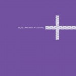
Project | Non-Profit Branding and Identity
Client | East San Gabriel Valley Japanese Community Center [ESGVJCC]
Having volunteered and served the East San Gabriel Valley Japanese Community Center for over a decade, it was with great pleasure to work on creating a new image for the community center that would help to re-position the center in the greater community while also shifting the image both for the current membership and the greater community as a whole.
The original logo of the ‘matsu’ tree no longer represented the entire membership body and it was felt that a new logo should be developed to serve two purposes. First, the new logo would have to be a reflection of the current membership and secondly, it would need to reflect the future of the community center and therefore be timeless in its’ design. A modern aesthetic that would still capture the culture of the centers’ roots and history was paramount as well.
A focused group of individuals and community leaders was formed and the result is a logo that I felt confident would best represent the missions and values of the community center and its’ members.
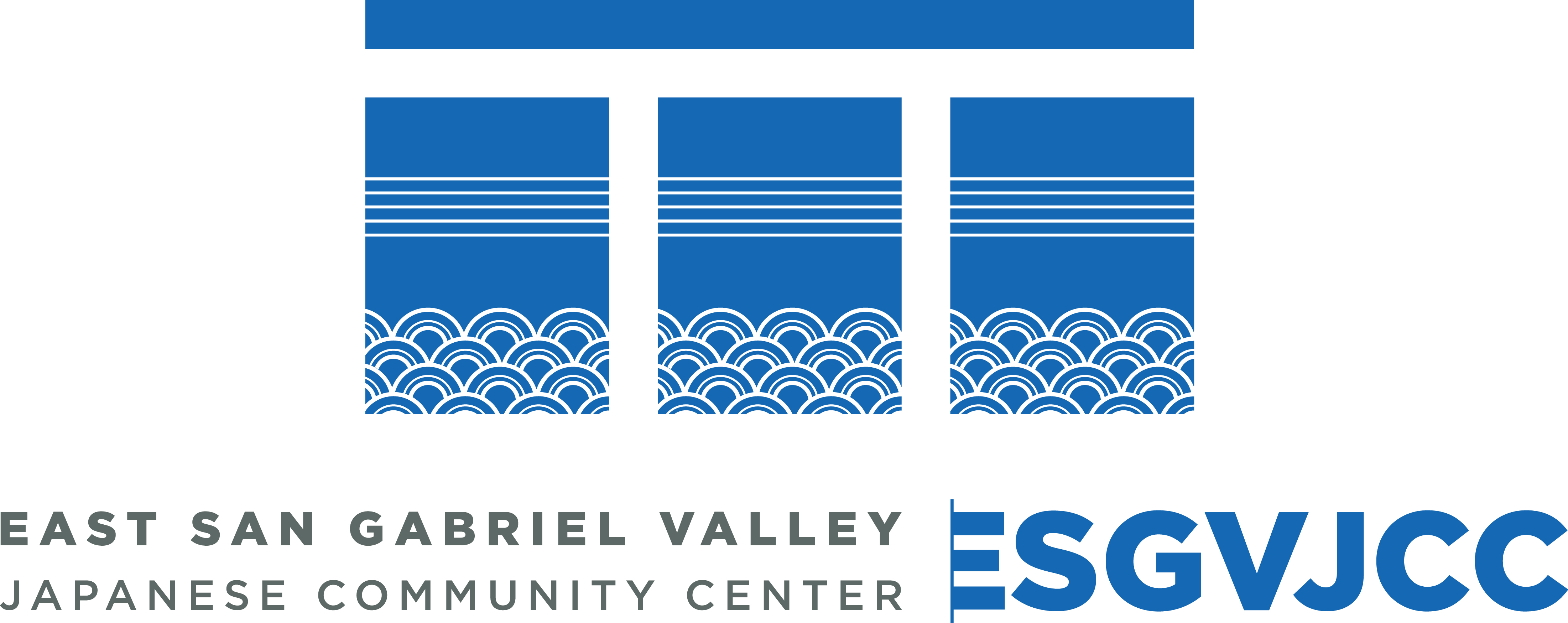
Pulling the information I included with the “Identity and Values” guide that I developed for the new logo and brand usage, here is an explanation of my vision for the new logo which was adopted at the close of 2011 and launched officially at the January 2012 Installation Banquet.
1 The bridge.
The bridge is an infinite symbol of the community center’s ability to connect generations, cultures, US-Japan relations and the greater community. It is a symbol of steadfast strength filling a void.
2 The horizon.
The community center honors its’ past by looking into the future and how it can grow and thrive by growing its’ resources, services, programs and activities.
3 The water.
The community center and its’ membership is a living entity that is in constant motion. The pattern itself is a timeless, traditional pattern that honors the arts, culture and history of the community center and its’ Japanese roots.
4 The banners.
The community center is central to the balance and order of the thriving Japanese American community and culture as well as to the greater East San Gabriel Valley community. As in the teaching of Ikebana it is Heaven, Earth, Man; Sun, Moon, Earth; Japan, ESGVJCC, US; City of West Covina, ESGVJCC, City of Ohtawara; etc.
5 The emergent ESGVJCC.
Emergent is defined as “coming into being”; “coming into view, existence”; “arising or occuring unexpectedly”; “demanding prompt action”. Combined with the other symbols of life, of future, of connection and growth, the emergent ESGVJCC further gives the narrative of the community center as a moving force; a force that, as with the new design, is coming into being and taking action as it continues to foster the vision of its’ founding fathers.

- Cover
- The Details
- Spread
Project | 2012 ESGVJCC Annual Report
Client | ESGVJCC
Naturally, the theme for the 2012 ESGVJCC Annual Report was centered around the launch of the new logo. Given the opportunity to design a more modern look, I highlighted the future of the community center by giving programs of growth, youth and advancement more focus with color and typographical hierarchy.
- Cover
- Spread
- Spread
- Spread
- Back Cover
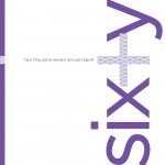
Project | 2011 ESGVJCC Annual Report
Client | ESGVJCC
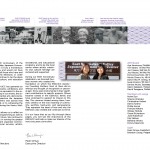
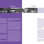
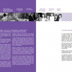
I like to think that the idea to change the perception of the East San Gabriel Valley Japanese Community Center through the re-branding of the corporate identity, actually came well before a task force was created to take up the challenge. In 2011 the ESGVJCC celebrated its’ 60th Anniversary and I used this opportunity to create a theme that would be carried out throughout the year. As shown in the annual report, the collateral for the year did not include the original logo of the matsu tree or original color theme. Before I even knew I would be redesigning the logo, somehow I had started changing perception just by detaching the logo of old.

